Qualify
Redesigning an enterprise media QA platform to make complex testing workflows faster, clearer, and easier to navigate.

Company
Telestream develops media-processing, monitoring, and quality-control solutions used by broadcasters, streaming platforms, content distributors, and other media organizations worldwide.
My Role
I led the UX/UI redesign of the latest generation of Qualify, focusing on simplifying complex QC workflows and creating a scalable experience that could grow with the product.

Overview
Role
Lead UX/UI Designer
Team
Product Manager · Engineering · UX/UI
Timeline
Q4 2023 – Q3 2025
Tools
Figma · Figma Make · Usertesting · Jira
Scope
Research · Design · Prototyping · Testing · Handoff
The Product
Qualify is an enterprise media quality-control platform that automatically analyzes media before broadcast and publication.
The platform supports extensive video, audio, and metadata compliance testing. It is designed for high-volume media operations across cloud, on-premises, and hybrid environments. Today, Telestream positions Qualify around scalable automated quality checks, with the ability to run nearly unlimited jobs in parallel.
FILE

DISTRIBUTION
The Challenge
How might we streamline a complex QC workflow for high-volume media operations?
Three Major Problems
The legacy experience required users to navigate between separate areas of the product, move through fragmented workflows, and search dense configuration screens to find specific tests. These issues were interconnected: fragmented navigation disrupted task continuity, while inconsistent information hierarchy made it difficult to understand where options lived and what required attention.
The challenge was to rethink how the product was organized and how it presented its functionality, so operators could quickly distinguish what was waiting, processing, completed, or failed and identify which jobs required attention without inspecting them individually.
Click on the tabs to view the apparent usability issues at first glance.
Large configuration pages contained dozens of controls with limited hierarchy, forcing users to scan and scroll through dense groups of tests to locate specific requirements. Once inside a template, users could encounter long pages containing dozens of technical tests, nested settings, checkboxes, dropdowns, and parameters.


Research & Discovery
Although several usability issues were immediately apparent, I wanted to look beyond surface-level improvements and develop a deeper understanding of how to enhance the overall user experience.
During user interviews, I gathered valuable insights that helped understand the primary user and what oppurtunities we can leverage against our competitors.
Persona
GOAL
Move media through QC accurately and efficiently.
NEED
A clear view of all ran jobs with fast access to individual test requirements, job status and failures.
Client Interviews
FRUSTRUTION
Some experienced users avoided building templates from scratch because manually setting it up took too long.
BEHAVIOR
They developed workarounds such as importing and reusing existing test configurations.
Competitive Analysis
Several Oppurtunties for Qualify
1. Progressive Discolsure by reducing visibility complexity
2. Centralized workflows by reducing fragmented workflow
3. Status visibility by directing users to areas that need attention.


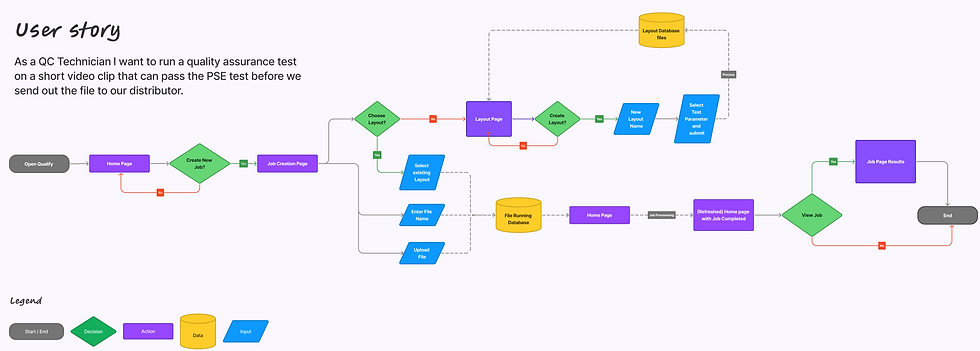
Mapping the Legacy Userflow
Mapping the existing flowchart revealed that actions belonging to the same user goal were distributed across multiple parts of the product.
The workflow wasn't only long; it repeatedly interrupted the user's context.
Issues
1. Backtracking
Users repeatedly returned to previous areas.
2. Context Switching
Configuration interrupted the primary job workflow.
3. Limited Continuity
Users had to figure out where to go next instead of being guided through one connected task.
The Solution
Research gave me four principles to carry into design:
Individual tests live within Parent categories and can be enabled or expanded as needed.
This lets users understand the overall testing environment without showing every technical parameter at once.
Experienced users often already knew which test they needed.
Search provided a direct path to individual tests, while the category hierarchy still supported users who wanted to browse.
Supporting actions such as creating a template were moved into contextual side panels.
Instead of navigating to another full page, users could complete the task while maintaining awareness of the workspace behind it.
For high-volume workflows, users needed to understand what required attention without inspecting every job individually. The redesigned Job Monitoring experience surfaces waiting, processing, completed, and failed jobs, along with elapsed time and alert counts. This makes it easier to scan the workload and prioritize exceptions.
Exploration & Iteration
Sketch. Test. Learn. Repeat.
These images illustrate the begging stage of the iterative process where the design principles were implemented before moving towards the final iterations.


The challenge was to create a scalable information hierarchy that allowed users to navigate and configure tests within a single page. By applying the principle of management by exception, I reduced cognitive overload by prioritizing warnings, failures, and items requiring attention.

The Telestream UX team has developed a design system with components, patterns, and behaviors that ensure consistency across all their products. This helps users recall and become familiar with the platform, making navigation more efficient.

One of the user's primary tasks is to run a test on a file. I moved this action to the job monitoring page, and a full-page side panel keeps the user on the page until they finish the task.
Final Deliverables
Qualify was part of a larger Telestream product ecosystem, not a standalone application. The redesign therefore needed to solve Qualify-specific workflow problems while remaining consistent with established Telestream interaction patterns and design-system components.
I refined the product’s terminology to make actions more intuitive and easier to identify.
For example, I renamed “Jobs” to “Job Monitoring” to clarify its purpose and “Test Configurations” to “Templates” to better reflect how users create and manage reusable testing setups. These changes established clearer mental models, reduced ambiguity, and helped users navigate between workflows with greater confidence and less friction.
High Fidelity Designs


Validaton &
Impact
High fidelity designs were prototyped and across 30+ usability testing sessions, I iteratively evaluated navigation, terminology, test discovery, configuration patterns, validation, and task completion.
Each round informed the next iteration.
AVG Time on Task
3 min
Decreased from 10 min
AVG SUS Score
88
From 32 Usability Test
AVG Completion on Task
93%
Increased from 74%
Feature Usage
95%
Users Confidence Increased
UX UI DESIGNER